Use the timeline below to learn more about how different modules in Jarvis Analytics can help you in your role.
Read the descriptions of when, and how to use each module to help you in your role.
Showing {{ scope.totalResults }} results for "{{ data.search }}"

Use the timeline below to learn more about how different modules in Jarvis Analytics can help you in your role.
Read the descriptions of when, and how to use each module to help you in your role.
Why would I use the Dashboard?
Example: Dr. Jones is managing 5 offices and he needs a way to view basic revenue data as well as Provider data for all of his offices at once. By going to the Dashboard Module, he is able to select ALL locations, put in his date range, and compare his practices. He can now easily see which office has the highest revenue and the provider with the highest production.
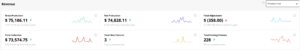
Aggregated Production, Adjustments and Collections for the selected date range are displayed. Red or Green trend arrows indicate increase or decrease to Prior year results.
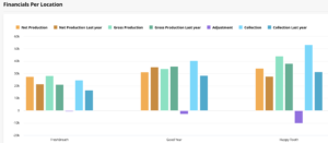
Individual practice Production, Adjustments and Collections are displayed in a graph format. Hover over the graph to view data details.
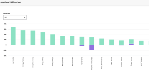
The 20 Providers with the highest production amounts are displayed in a utilization graph. Production associated with multiple locations is represented by various colors in the bar graph.
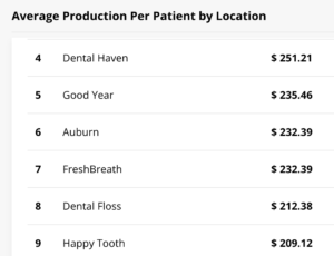
Performance tables display and rank location Average Production per Patient and Total Production per Provider.
Monday to Friday
Expected Response Time: 24 hrs
Monday to Friday